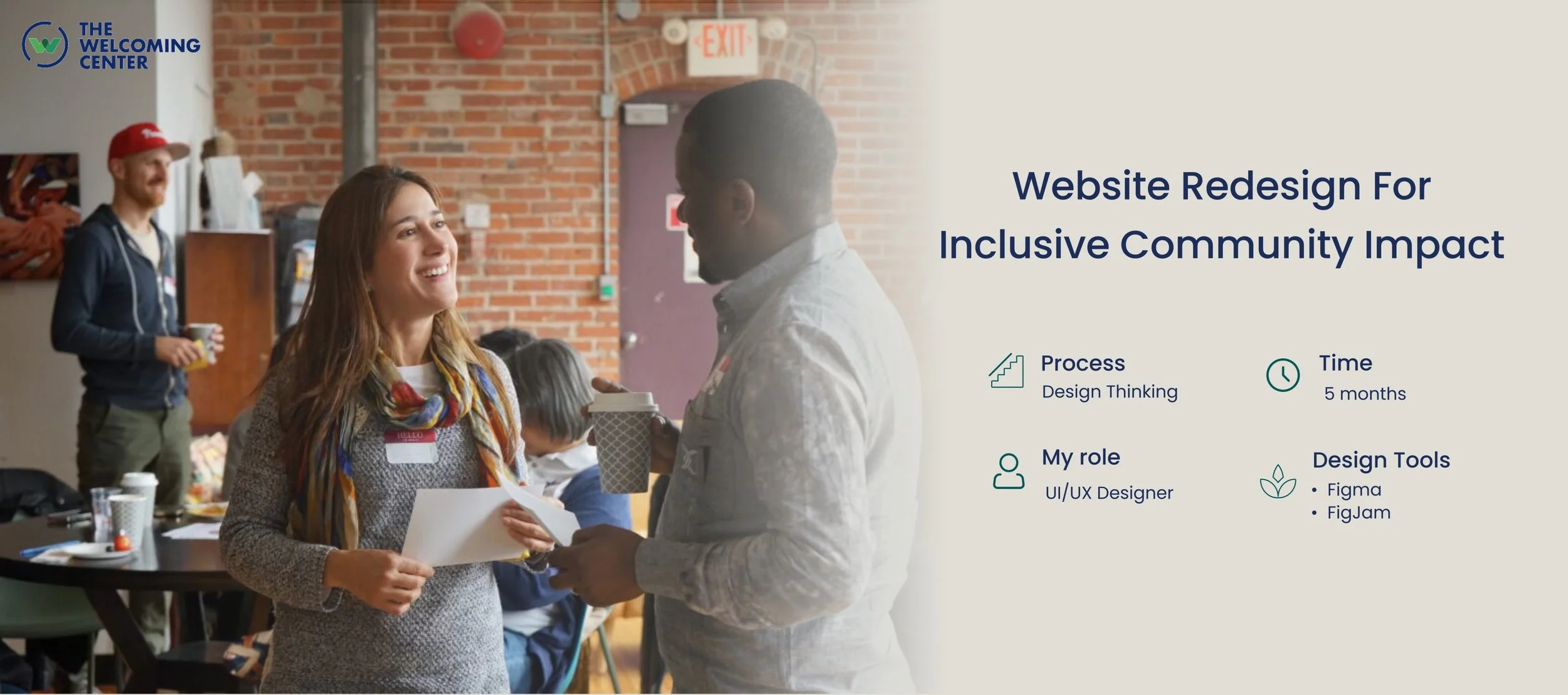
*Successfully launched — visit the live website here ↗
Every year, The Welcoming Center supports over 17,000 immigrants from more than 150 countries as they build new lives, careers, and communities in Philadelphia

While the organization itself felt warm, supportive, and deeply human, its website didn’t fully reflect that experience. Important resources were difficult to navigate, stories of impact were easy to miss, and different audiences — from immigrants to donors and volunteers — often struggled to find what they needed

This redesign was an opportunity to create a digital experience that felt more like The Welcoming Center itself: welcoming, accessible, empowering, and community-driven.

To better understand what makes The Welcoming Center feel truly welcoming, I conducted secondary research on the organization’s brand attributes and explored how other nonprofit websites communicate trust, support, and community online. I wanted to see not only what information these organizations included, but also how they made people feel through design, storytelling, and navigation.
I then interviewed 29 people who had participated in The Welcoming Center’s programs to learn about their real experiences with the website. Through these conversations, a clear pattern began to emerge.
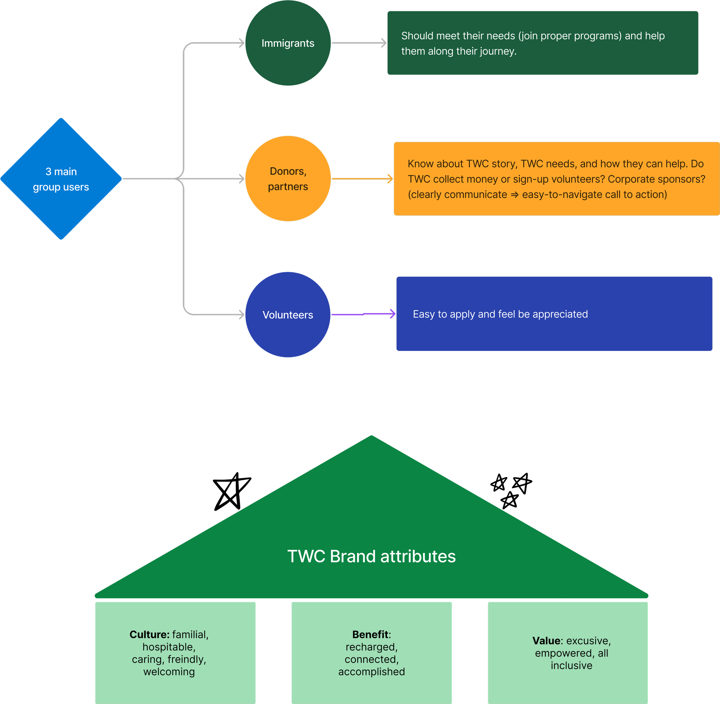
Before organizing the website, I first needed to understand the organization behind it.
I collaborated closely with the Product Manager and program leads to learn how The Welcoming Center supports immigrants across different stages of their journey — from language learning and job readiness to entrepreneurship, wellness, and community engagement.
During these conversations, one challenge became clear:
The organization offered many valuable programs, but the website structure made them difficult to discover and understand.
Different teams also had different priorities they wanted to highlight, which made the navigation feel fragmented and overwhelming for users.
To solve this, we stepped back and focused on the bigger picture:
How can we organize the experience in a way that feels intuitive, welcoming, and easy to navigate for someone arriving for the first time?
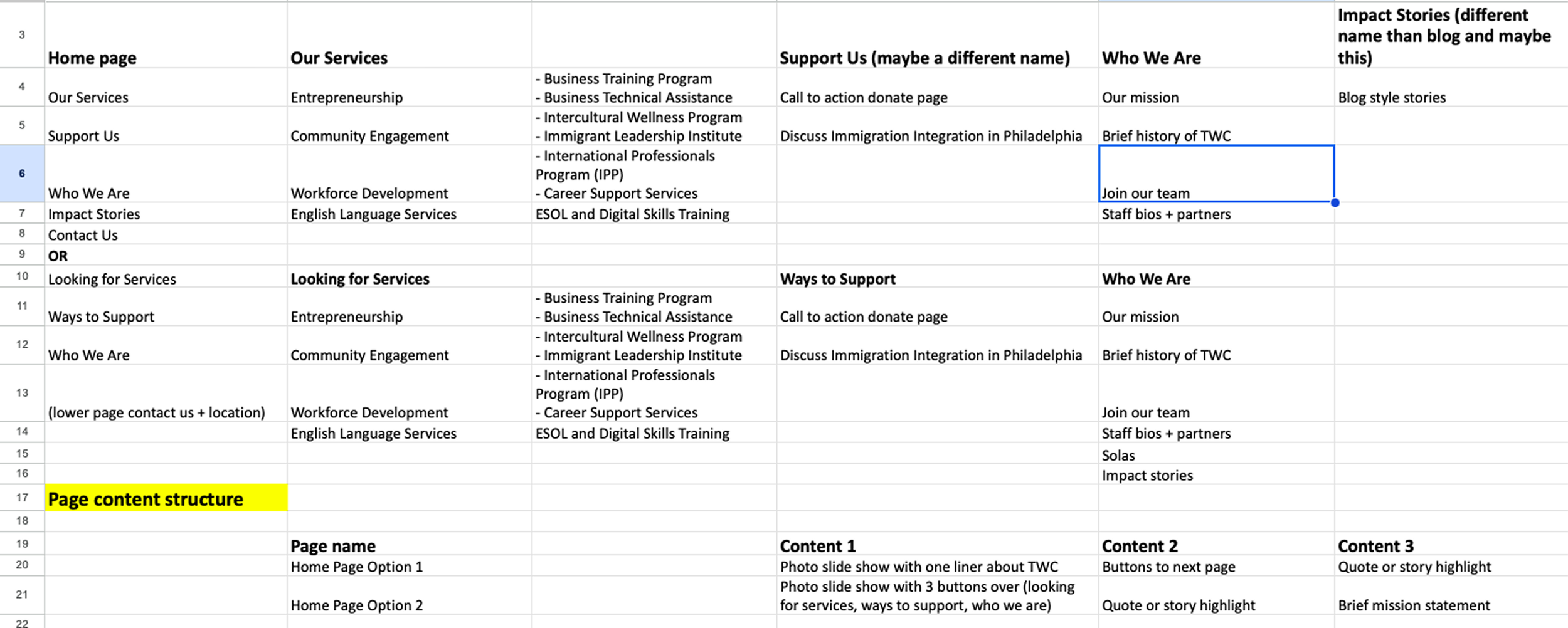
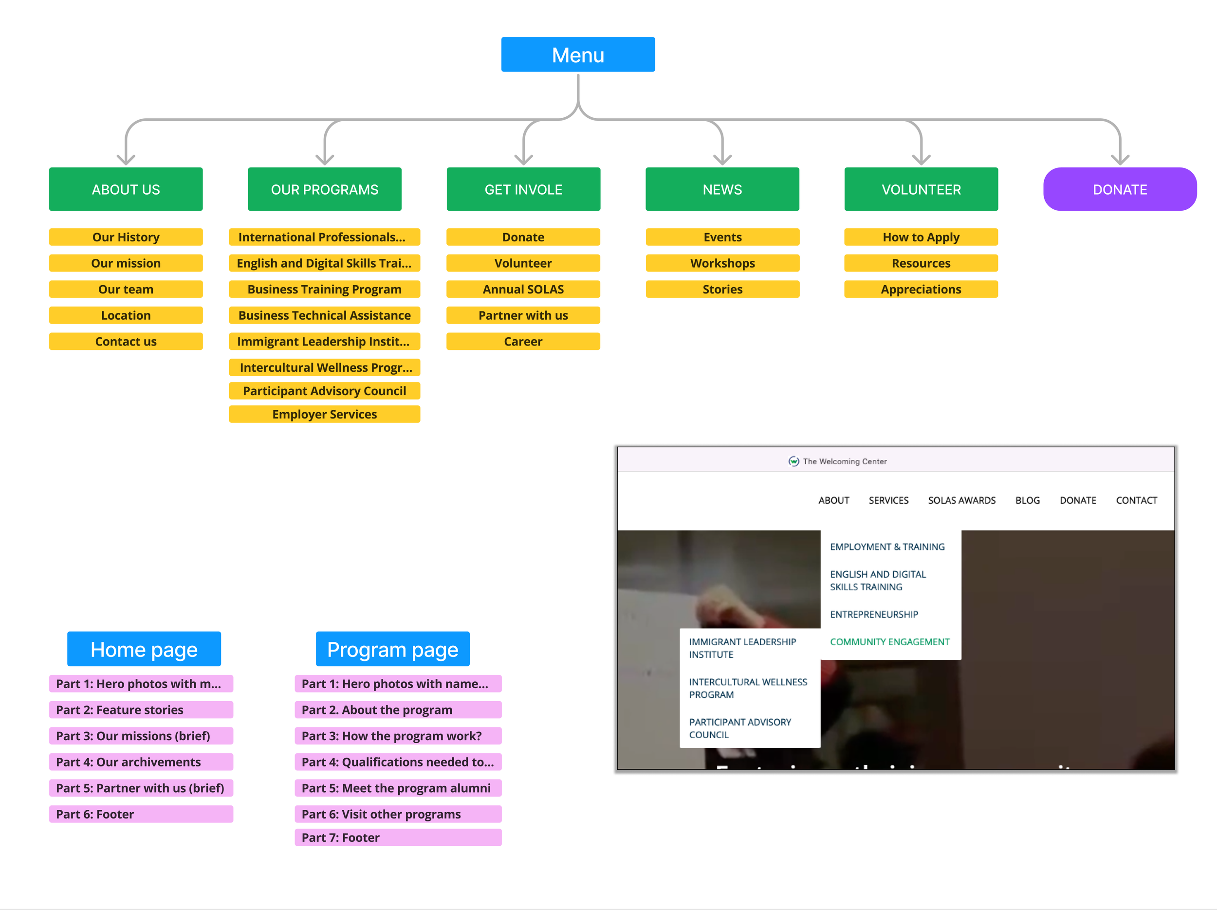
Together, we mapped relationships between services, audiences, and goals, then translated those insights into a clearer information architecture and sitemap.
This process helped transform the website from a collection of pages into a more connected and guided experience.
The Welcoming Center homepage before the redesign
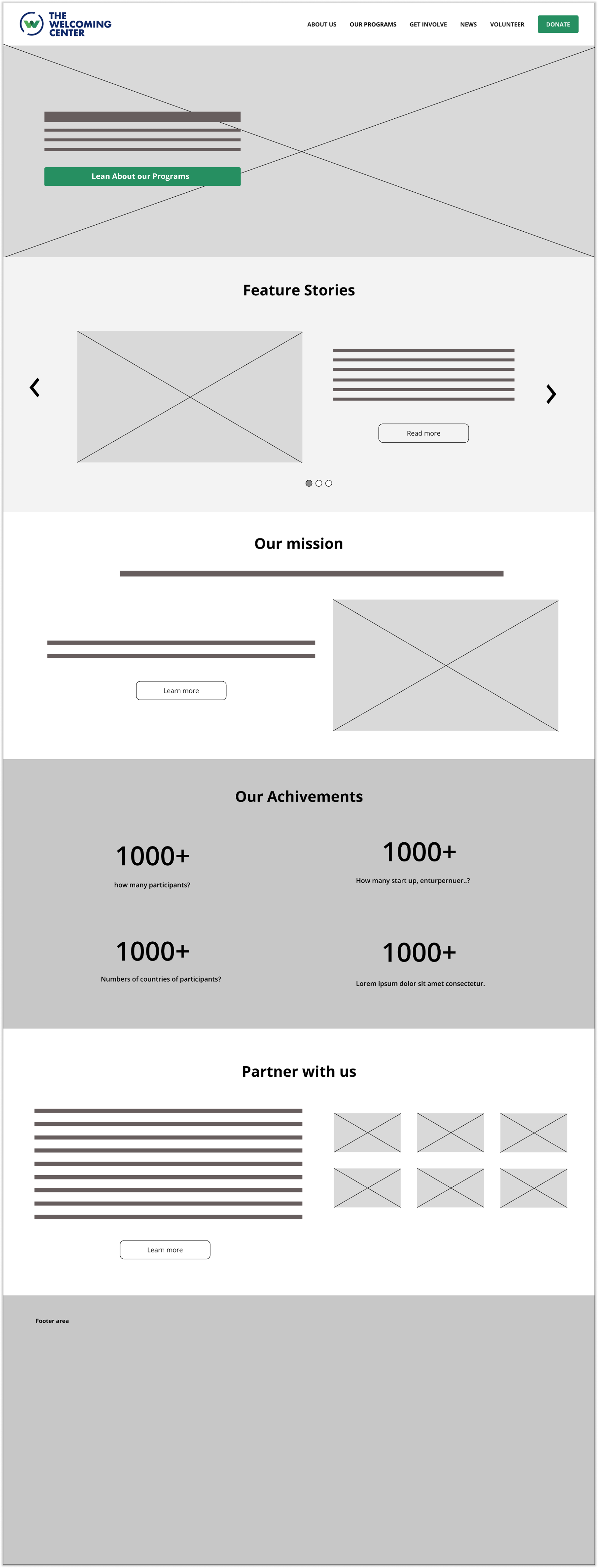
Before moving into high-fidelity designs, I started with wireframes to focus on structure, content hierarchy, and user flow without being distracted by colors or visual details.
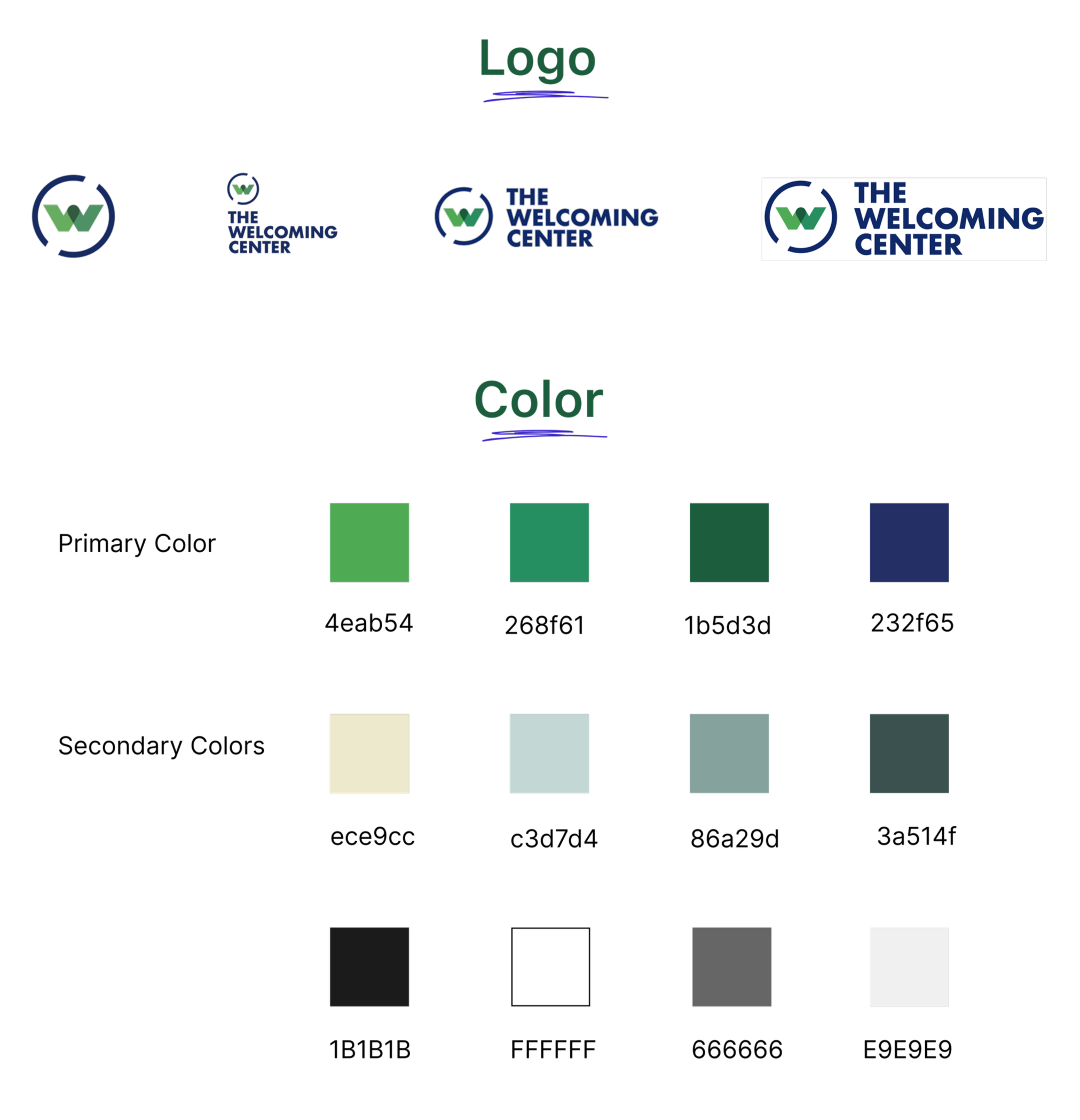
I worked closely with the Project Manager to ensure the redesign stayed aligned with The Welcoming Center’s existing brand identity and style guide.
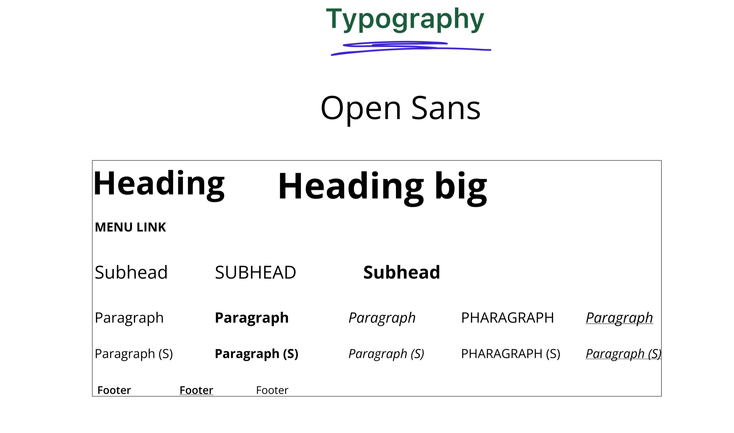
The green tones helped communicate growth, support, and community, while the dark blue added a sense of trust and professionalism. I also used Open Sans throughout the interface to keep the experience clean, readable, and accessible for a wide range of users.
Creating this visual foundation early helped make the website feel more consistent, approachable, and connected to the organization’s welcoming mission.
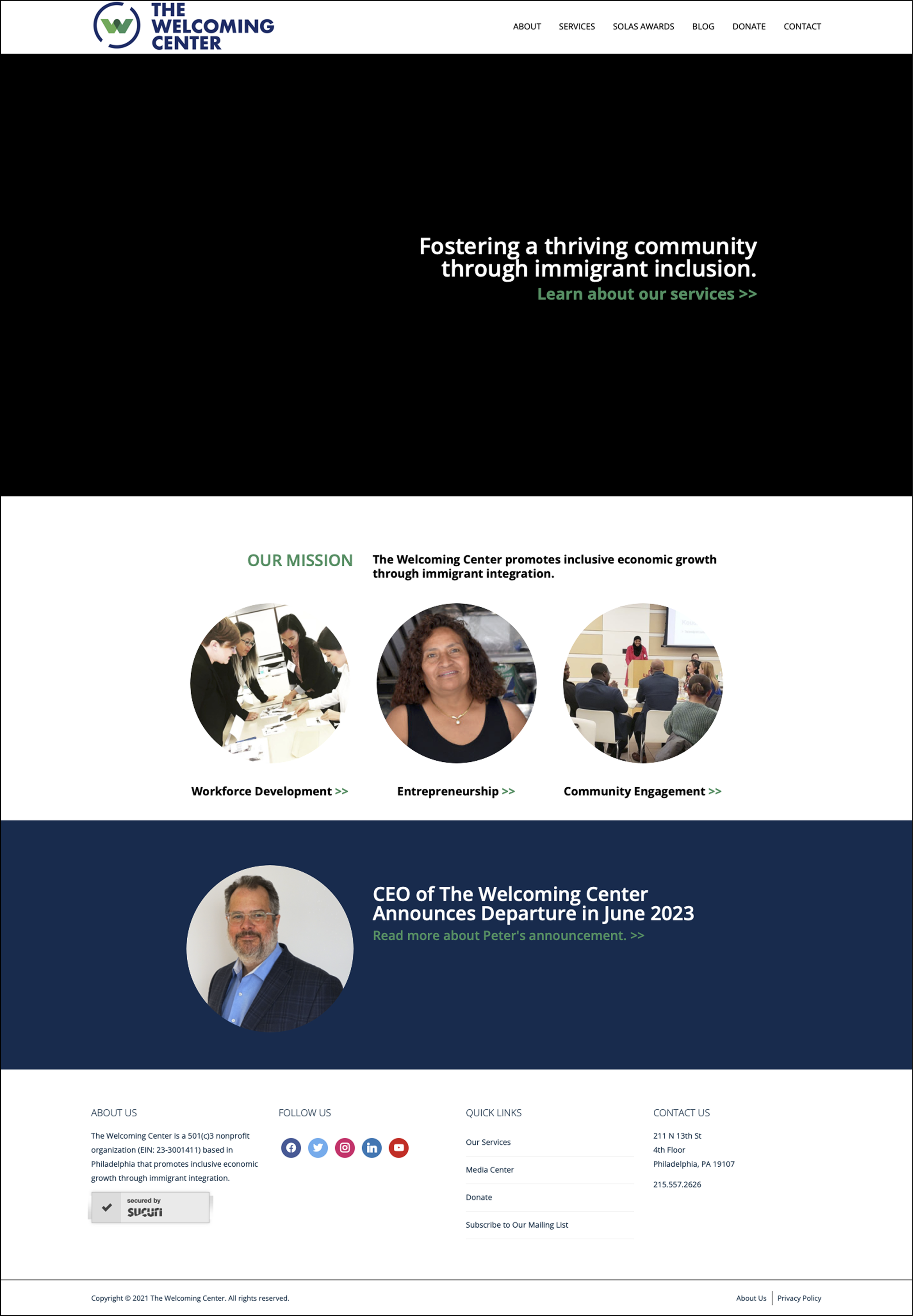
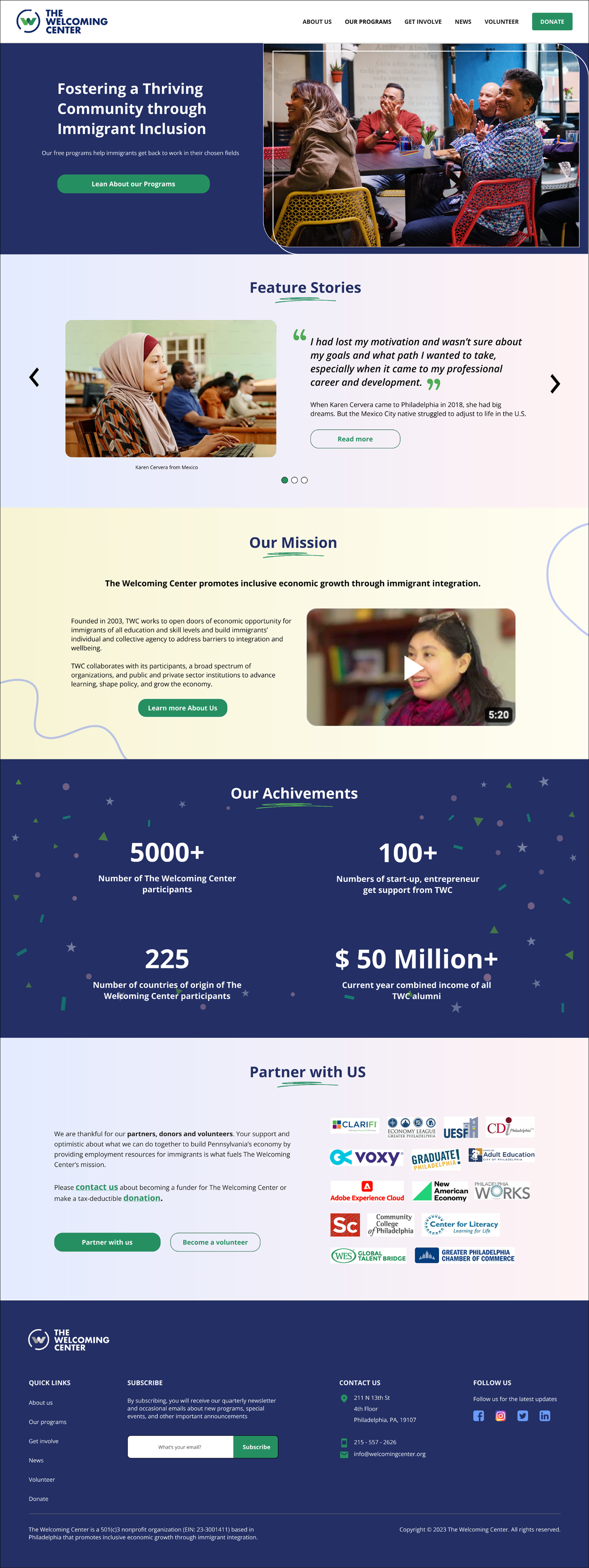
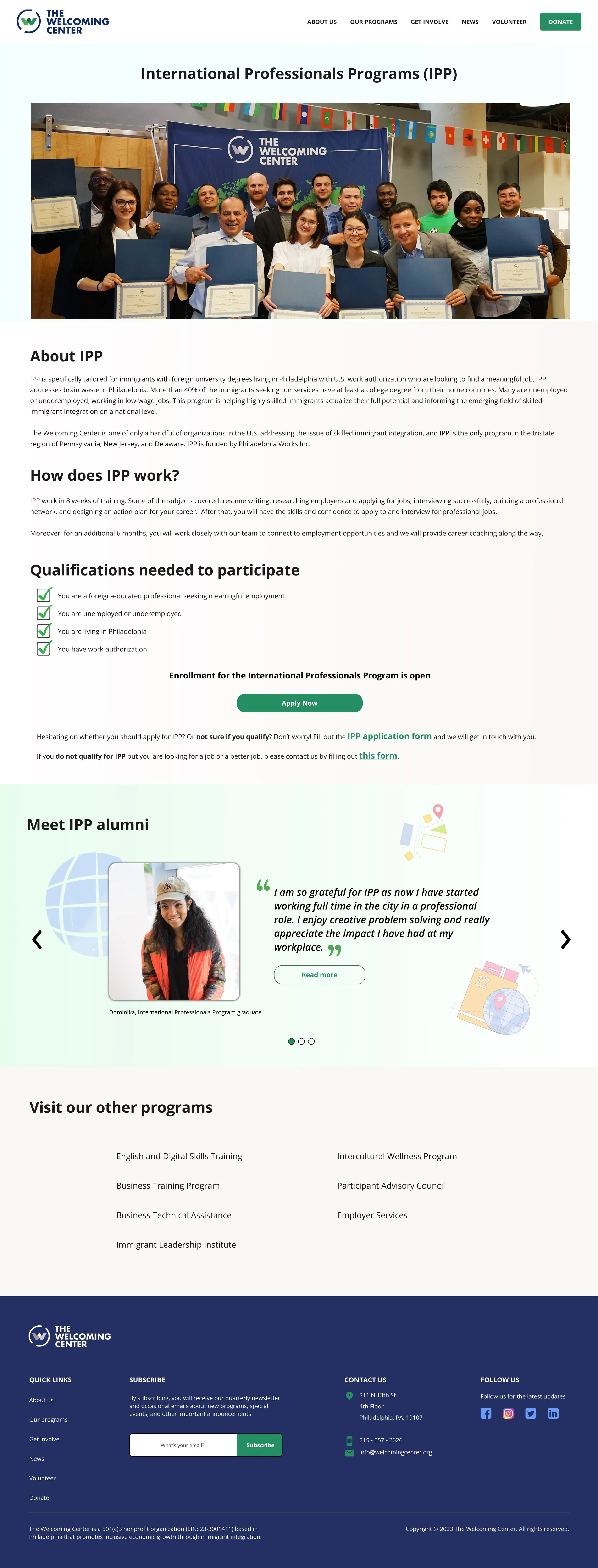
With the sitemap and content structure were validated, I moved into higher-fidelity prototypes to explore how the experience would feel in a more realistic environment. I designed the homepage and program pages around the structure we had already established — making sure each section had a clear purpose, hierarchy, and user journey
The homepage was designed to quickly communicate the organization’s mission, highlight real community stories, and guide visitors toward the right programs or actions.
For the program pages, I focused on helping users clearly understand:
what each program offers,
who it supports,
how it works,
and what steps to take next.
Because the content structure had already been thoughtfully planned earlier, the design process felt much more intentional and focused.
I then shared the prototypes with both stakeholders and users for feedback and usability testing.
The response was incredibly positive.
Stakeholders appreciated how the new structure better represented the organization’s wide range of services while still feeling organized and approachable. Users found the experience easier to navigate, more welcoming, and clearer to understand compared to the previous website.
One of the most rewarding moments was seeing people immediately understand where to begin — something that had been a major pain point in the old experience.
The redesigned website officially launched using WordPress.
Like many real-world projects, there were technical and platform limitations during implementation. Not every interaction from the original mockups could be translated perfectly into development
But what mattered most survived the process:
the feeling
The final experience successfully carried forward the warmth, clarity, and accessibility that guided the redesign from the beginning
Seeing the project go live was especially meaningful because this wasn’t a concept project. It became a real tool actively supporting immigrants, volunteers, donors, and partners in Philadelphia